This is the second part of a previous post found
here. If you haven't done so yet, go read it. Now, as promised, here is a summary list of the tools which can be used to visualize various aspects of software quality. I will provide a short description for each kind of visualizations and for more detail, I strongly recommend you go visit Erik's blog at
http://erik.doernenburg.com/.
For all of the following types of software quality visualization charts or graph, you must first collect and aggregate the metrics data. This can be done using static analysis tools, scripts or even Excel. What is important is defining
what you want to measure, finding the best automated way to get the data (
how) and aggregating the necessary measures to produce the following views. Each of the following views have different purposes however, they are all very easy to understand and give you a very simple way to see the quality of your software.
Toxicity Chart
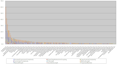
The toxicity chart is a tool which can be used to visualize the internal quality of your software, more specifically, it can show you how
truly horrible your code is. In the toxicity chart, each bar represents a class and the height of each bar is a composition of metrics showing you how toxic the class is. So, the higher the bar, the more
horrible the class is. It can be an effective way to represent poor quality to less technically inclined people (e.g. management types).
 |
| Toxicity Chart |
An example of a metric which composes the bar could be the length of a method. To generate this measure, you must define a threshold for the specific metric which would then produce a proportional score. For example, if the line-of-code threshold for a method is 20 lines and a method contains 30 lines, its toxicity score would be 1.5 since the method is 1.5 times above the set threshold. For more details on the toxicity chart, read the following
article.
Dependency Structure Matrix
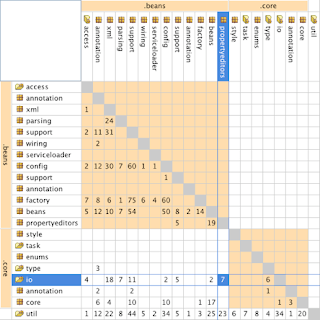
The following matrix is used to understand structure by showing dependencies between groups of classes such as packages (in Java) or namespaces (in C#). The resulting table can be used to uncover cyclic dependencies and level of coupling between these groups. For more details on the DSM, go read the following
article.
 |
| DSM |
Metric Tree Maps
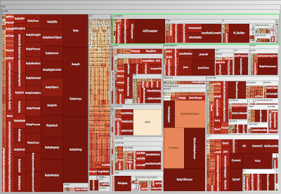
A metrics tree map visualizes the structure of the code by rendering the hierarchical package (namespace) structure as nested rectangles with parent packages encompassing child packages. (Excerpt taken from
Erik's blog). For more details on the metric tree maps, go read the following
article.
 |
| Metric Tree Map Polymetric View |
Visualizing Build Pain
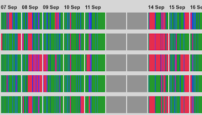
The following graph shows a series of "build lines" representing the state of builds over time. Each build gets a line. This is very useful in
continuous integration environments as it gives you a high level view of build related problems. Colour is used in the following way: green for good, red for broken, and blue for building. So, if you set this up on a big screen in a highly visible area of your office, people will know very quickly when many problems arise. As an added bonus, keeping the build lines from past days will give you an idea of how well the development teams have reduced the broken builds from the past. For more details on the build line graphs, go read the following
article.
 |
| Build Lines |
System Complexity View
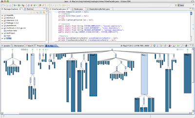
System Complexity is a polymetric view that shows the classes of the system, organized in inheritance hierarchies (excerpt from
Moose Technology). Each class is represented by a node:
- width = the number of attributes of the class
- height = the number of methods of the class
- color = the number of lines of code of the class
 |
| System Complexity Polymetric View |
CodeCity 3D View
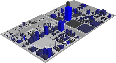
Finally, this type of visualization has to be the most awesome way to look at your software. CodeCity is written by Richard Wettel and is an integrated environment for software analysis, in which software systems are visualized as interactive, navigable 3D cities. The classes are represented as buildings in the city, while the packages are depicted as the districts in which the buildings reside. The visible properties of the city artifacts depict a set of chosen software metrics (excerpt from
Moose Technologies). For more details on this, you can also go read the following
article.
 |
| CodeCity Polymetric View |
 The past three days have been quite intense and I'm on the verge of a total information overload. All that aside, the QCon San Francisco International Software Development Conference was in my eyes a great success. Me and my work colleague came here on an information seeking mission and I can now say with great confidence that we have achieved our goal. In fact, we might have collected enough data to sift through for the next couple of weeks which will then package that in a form that is consumable in our work environment. The discussions and idea exchange will definitely continue for us but at a more local level. Some of the posts on this blog have been updated with new information as it was make available so don't be shy to re-read some of them. Also, for those would couldn't make to QCon SF in person, don't forget to check-out InfoQ.com in the coming weeks for videos of some of the presentations.
